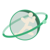
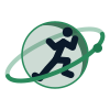
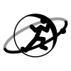
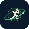
One drawing, everywhere. The runner is the athlete; the planet is the life they run on; the ring is the plan that keeps moving around them. This page is the reference for anyone who puts the mark on something.
Drawn once in the repo (scripts/build-brand.mjs). Every copy on this page, in the app and on the site is checked against that file.
Isle of Man Green planet, filled to 22%, one terminator: a lit crescent on the satellite side and a uniform night side. The ring passes behind the planet and in front of it, and the satellite sits on the lower right.
The default. Ink runner, green ring, mint satellite. Use on the Dusk navy or a tile.
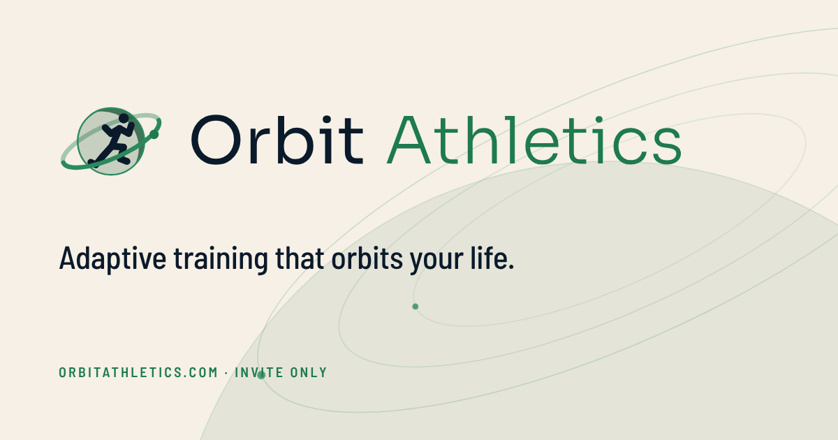
For paper and light surfaces: navy runner, a deeper green ring so it still reads. Never the navy version on white.
For embroidery, stamps and engraving: the planet as an outline, the crescent solid. Any single ink.
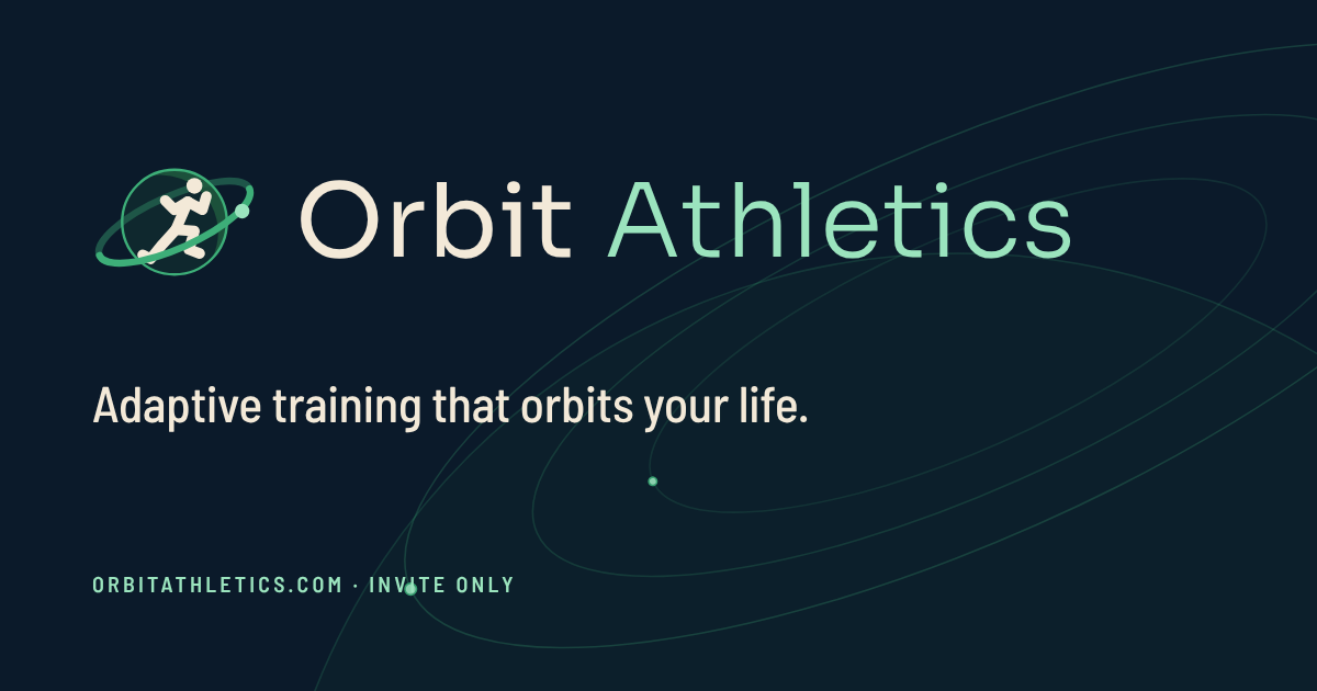
The wordmark sits on the planet's centre line, not the ring's (the ring overhangs to the right by design). The gap is 23% of the mark's width at every size. "Orbit" is Sora 400, "Athletics" is Sora 300 in mint on dark and in #1E7A4F on light. The wordmark is part of the logo and stays Sora whatever the app's typeface.
The planet's radius on every side, about a third of the mark's height. Nothing else inside that box.
24 px tall on screen, 8 mm in print. Below that use the favicon variant, which drops the tile radius and enlarges the mark.
The mark's box is 94 × 66 (the tight viewBox). The planet sets the height and the ring sets the width. Scale it, never stretch it.
On cream and on white the runner is navy, the ring #2A8A5C and the satellite #1E7A4F: 4.7:1 on cream and 5.3:1 on white, over the 3:1 a graphic needs (the old #3DAE78 read 2.5 and 2.8). The light SVG and the light lockup carry it, and so does the app's day look.
On cream, #F6F0E6
At its 24 px minimum, on cream and on white
On white, #FFFFFF
Two looks, night and day, the same tokens the app and this site draw with: the app follows the phone, and switches at sunset on Automatic. Cards are glass above the sky (lighter than it at night, white by day), never tiles darker than it. Green is the only colour that means Orbit; gold, sky, coral, violet and the HYROX pink belong to the data, each with a day version that reads on cream.
#07121E#0B1A2A#0F2133#152B41#FAF3E6#BAC6CF#8E9DAA#3DAE78#5CCB94#9BE4BE#1F5B3E#F5F2EA#ECE7DB#FFFFFF#F1EEE6#0B1A2A#3D4D5A#5F6D79#1F5B3E#2B7A54#1E7A4F#2A8A5C#E5B96A / #8F6210 · fatigue, warnings, lifts#8FB8E8 / #2E69A8 · form, long runs#F0916A / #B4431A · alerts, hard work#B795D6 / #7A4FA8 · other sports#D46A8C · HYROX sessionsBarlow Semi Condensed for what is looked at: headings, numbers, stats, session names and the small uppercase labels (spaced .09em). Barlow for what is read: body, buttons and inputs. Digits that line up are tabular. The scale is 60 / 32 / 22 / 18 / 16 / 14 / 11.5. Sora is the wordmark alone.
One primary button on a card at most. Gradients are for buttons and nowhere else.
The bars, the cards and the tiles are glass: a 34 px blur at 195 % saturation over the sky, a 1 px lit rim, and the light that follows a finger across the tab bar. A sheet that covers the page is solid, so nothing behind it reads through.
--sheet-solid), no blur.Like moving through a liquid: things spring when pressed and rise as they arrive. None of it runs when the reader prefers reduced motion; the screen is complete and still.
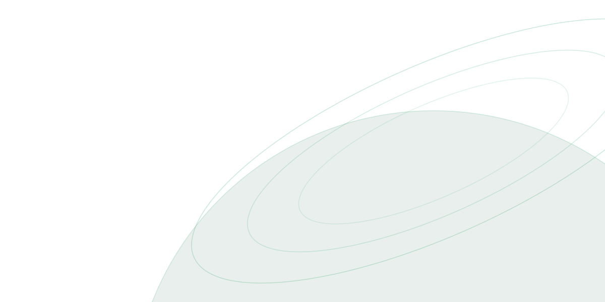
Three tilted orbits around one centre, a planet horizon, two satellites that travel their orbits. It sits at low opacity behind heroes and sign-in screens, leans toward the pointer on the site, and stops moving when the reader prefers reduced motion. The starfield beneath it is still, seeded, and the same sky on every visit.
Everything is generated from the one drawing. Social sizes and print files are here; the Figma file carries the same as components and variables.
Fonts: Barlow, Barlow Semi Condensed and Sora (the wordmark), all from Google Fonts under the SIL Open Font License.